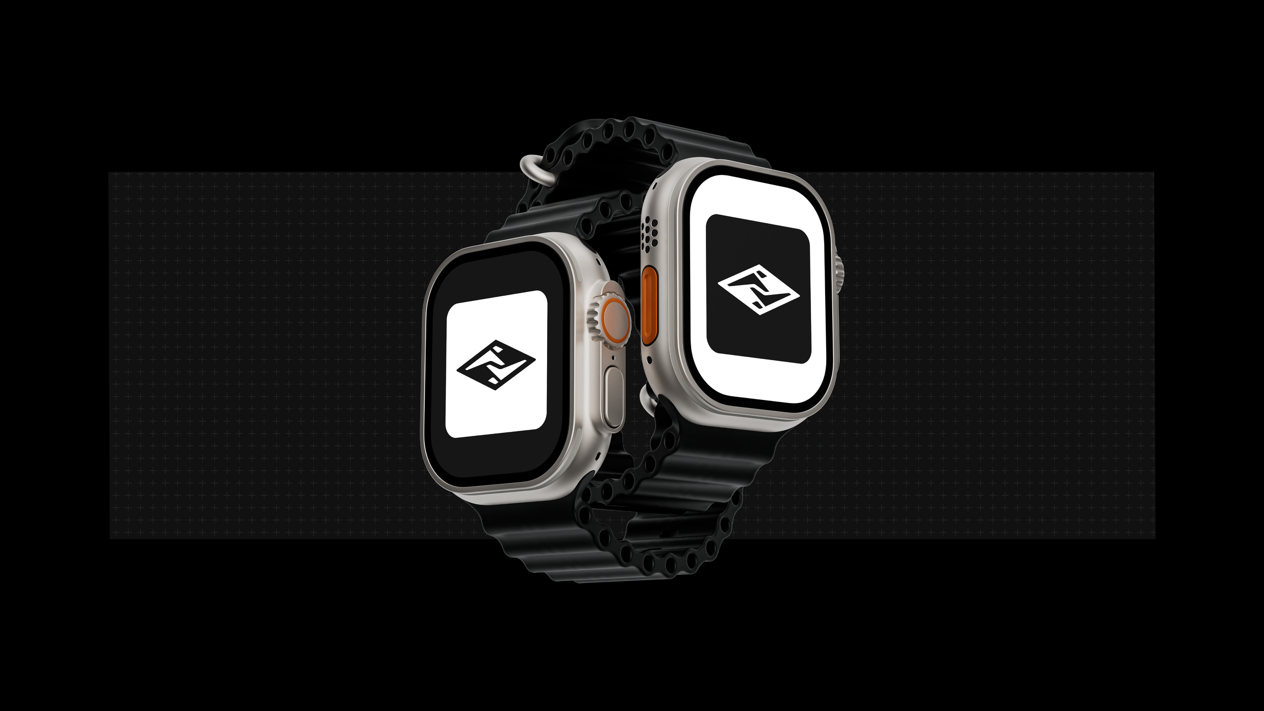
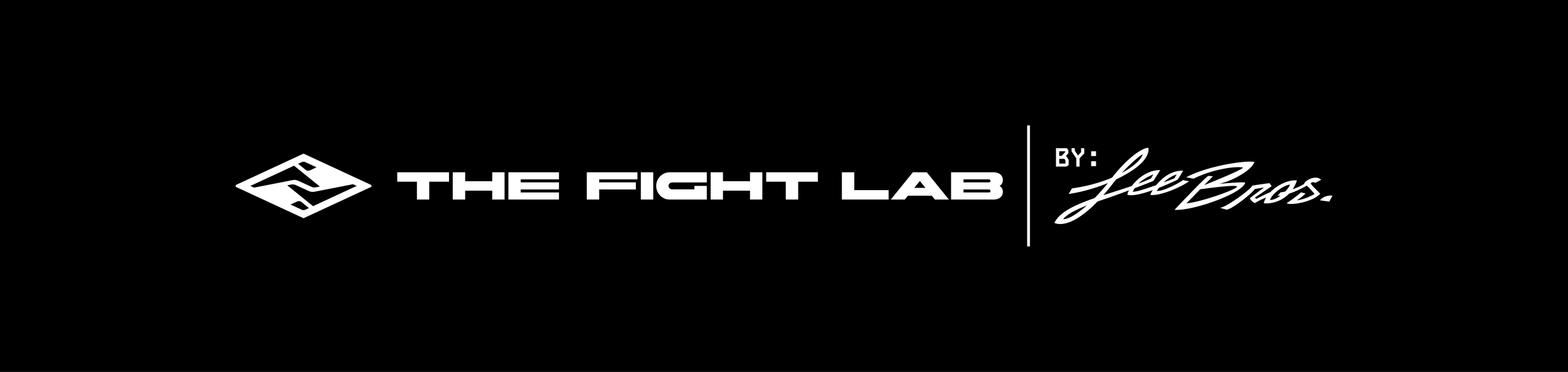
LEE BROS MMA: THE FIGHT LAB
Role: Creative Direction & Design
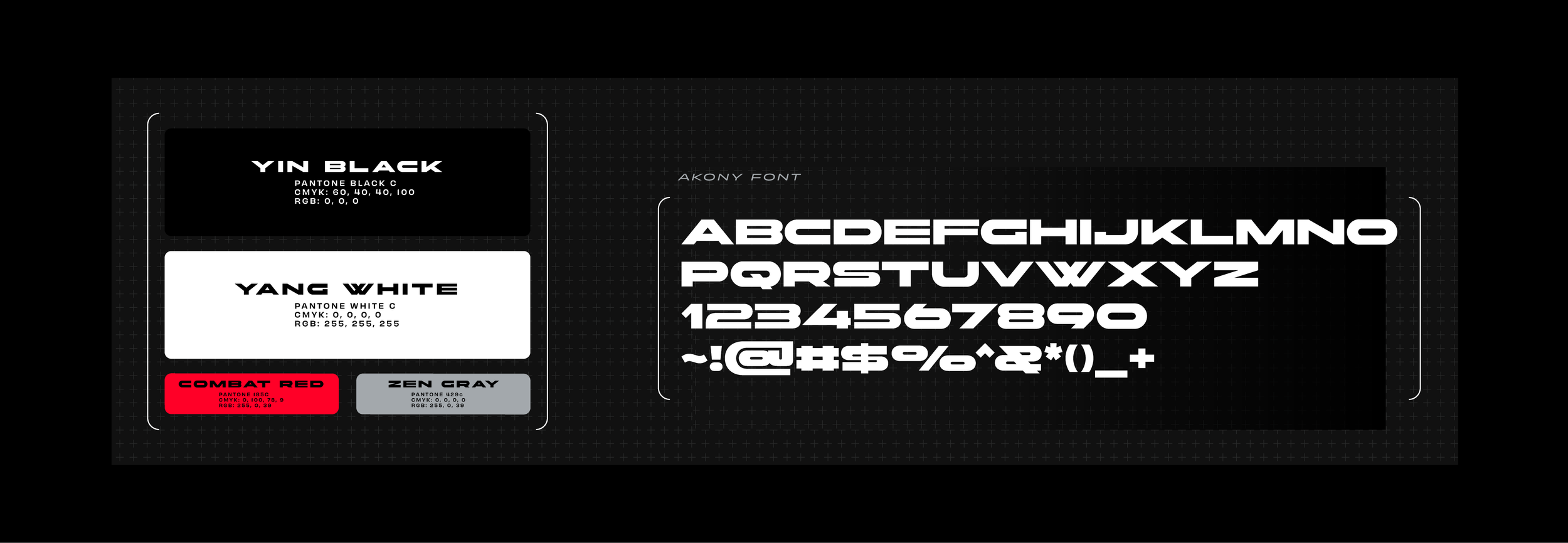
Lee Bros MMA, an evergrowing gym catering to both casual training enthusiasts and professional/amateur fighters, enlisted my expertise to develop their brand identity for their newly established modern facility, The Fight Lab. The concept behind The Fight Lab is to provide a unique training environment that seamlessly blends cutting-edge technology with traditional martial arts discipline. As part of the brand development process, we aimed to ensure that the visual identity of The Fight Lab encapsulates its ethos of innovation, inclusivity, and excellence in training.
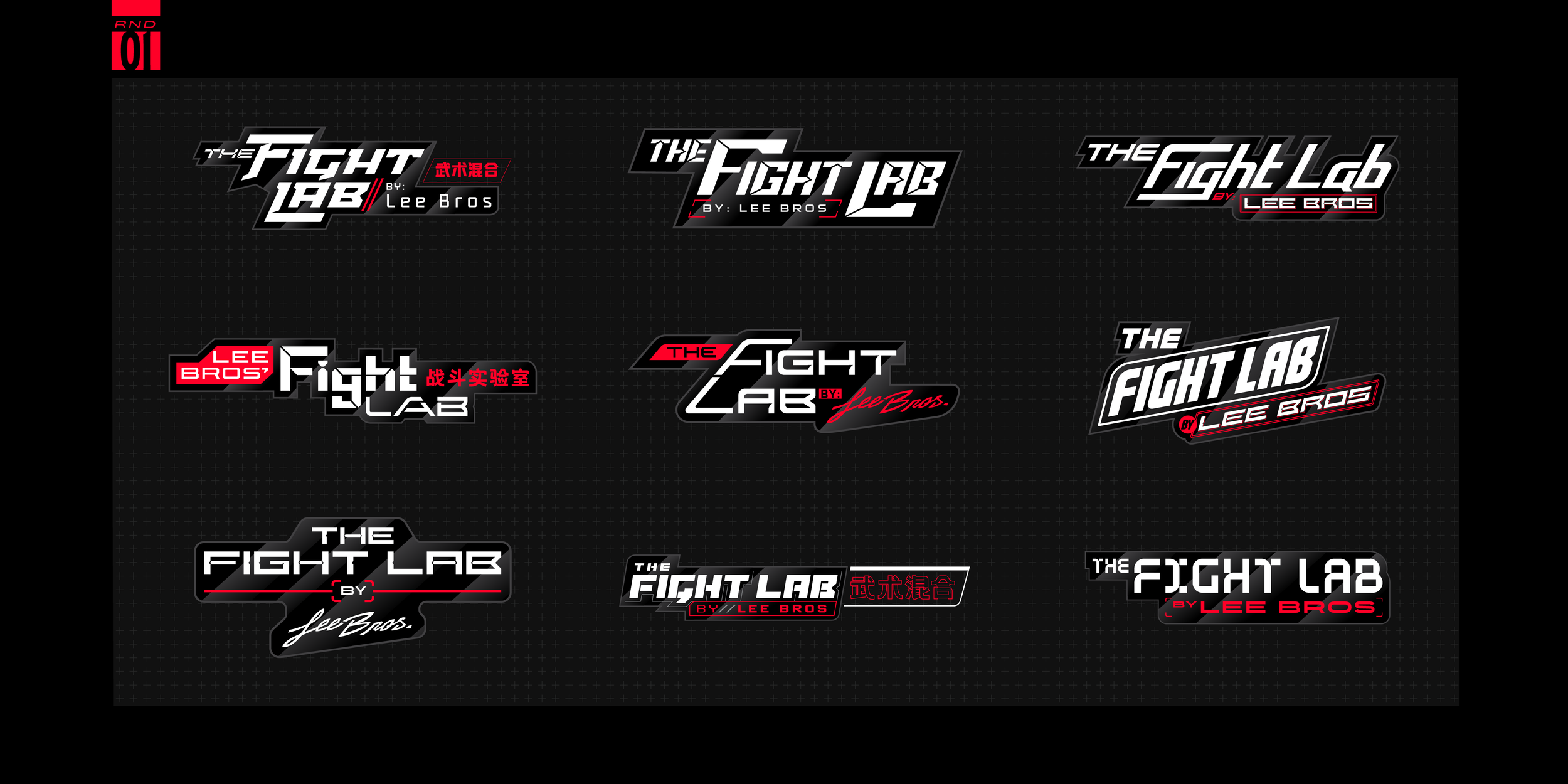
Logo Development
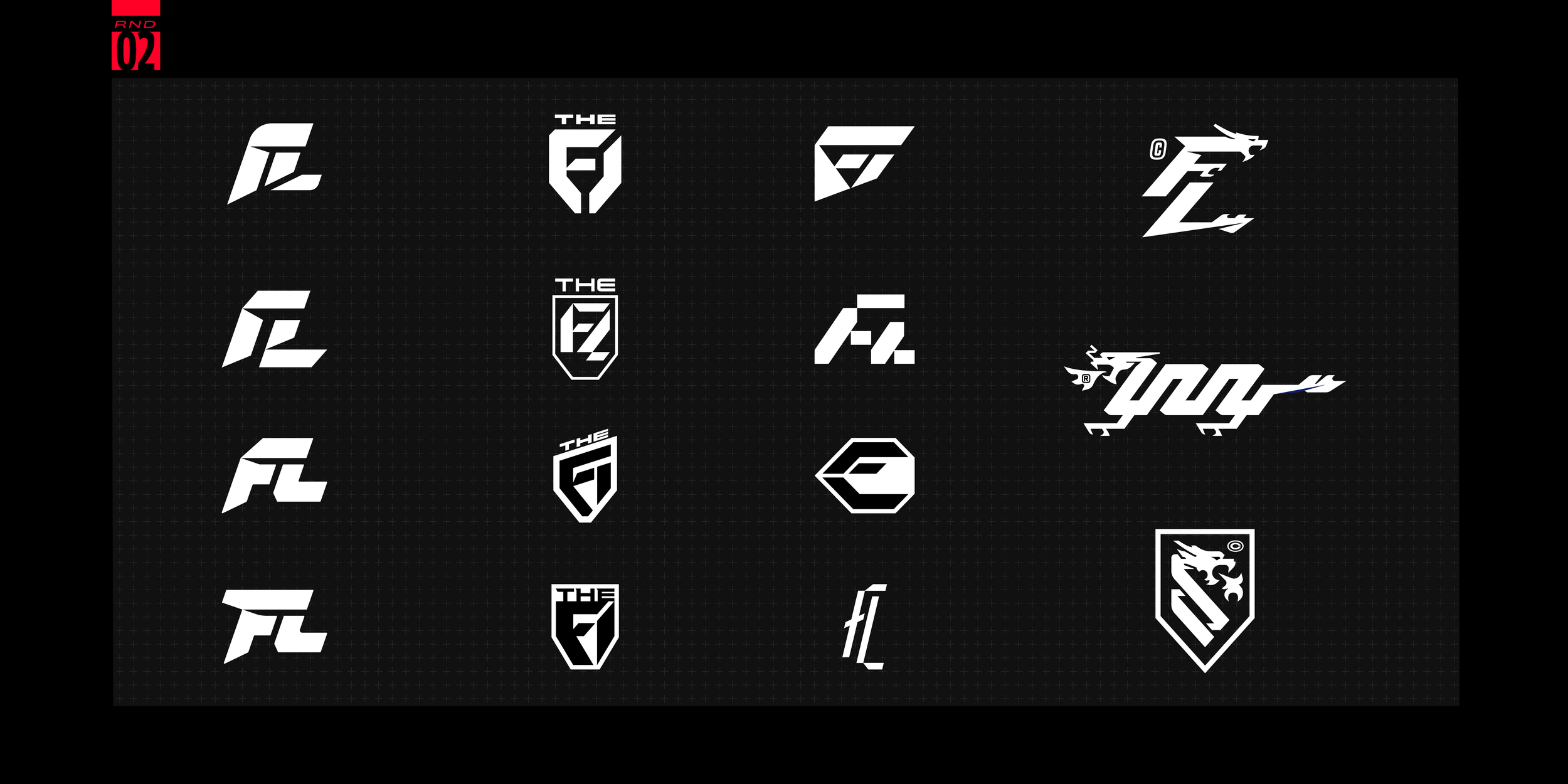
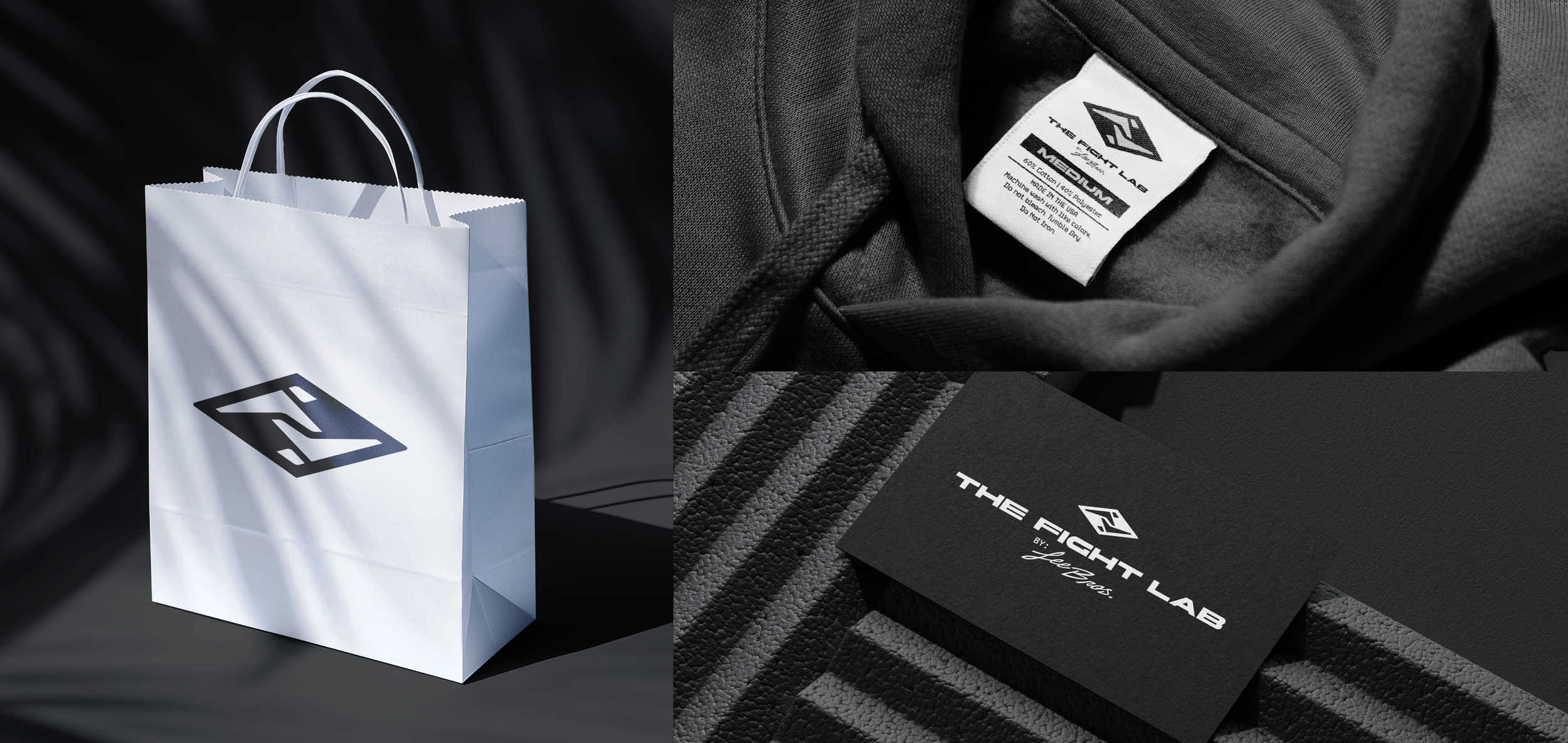
Initial explorations dwelled in designing the logo to be tech-sports driven lock-ups heavily influenced by Chinese Neon signages. After further conversations; the client sought to tone down the design to something more clean and minimalist to broaden the usage of the brand. As such onto the 2nd round we focused on F+L functions and the use of Dragons and Badges. This round honed in the feel we would settle on. In the final rounds we approached abstract F'‘s, L.s and the human figure in motion, landing on taking a previous iteration of the founding logo and amplifying it to a modern, polished icon paying homage to the roots and the future of the Dojo.


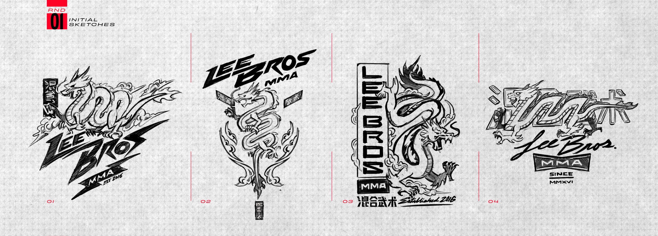
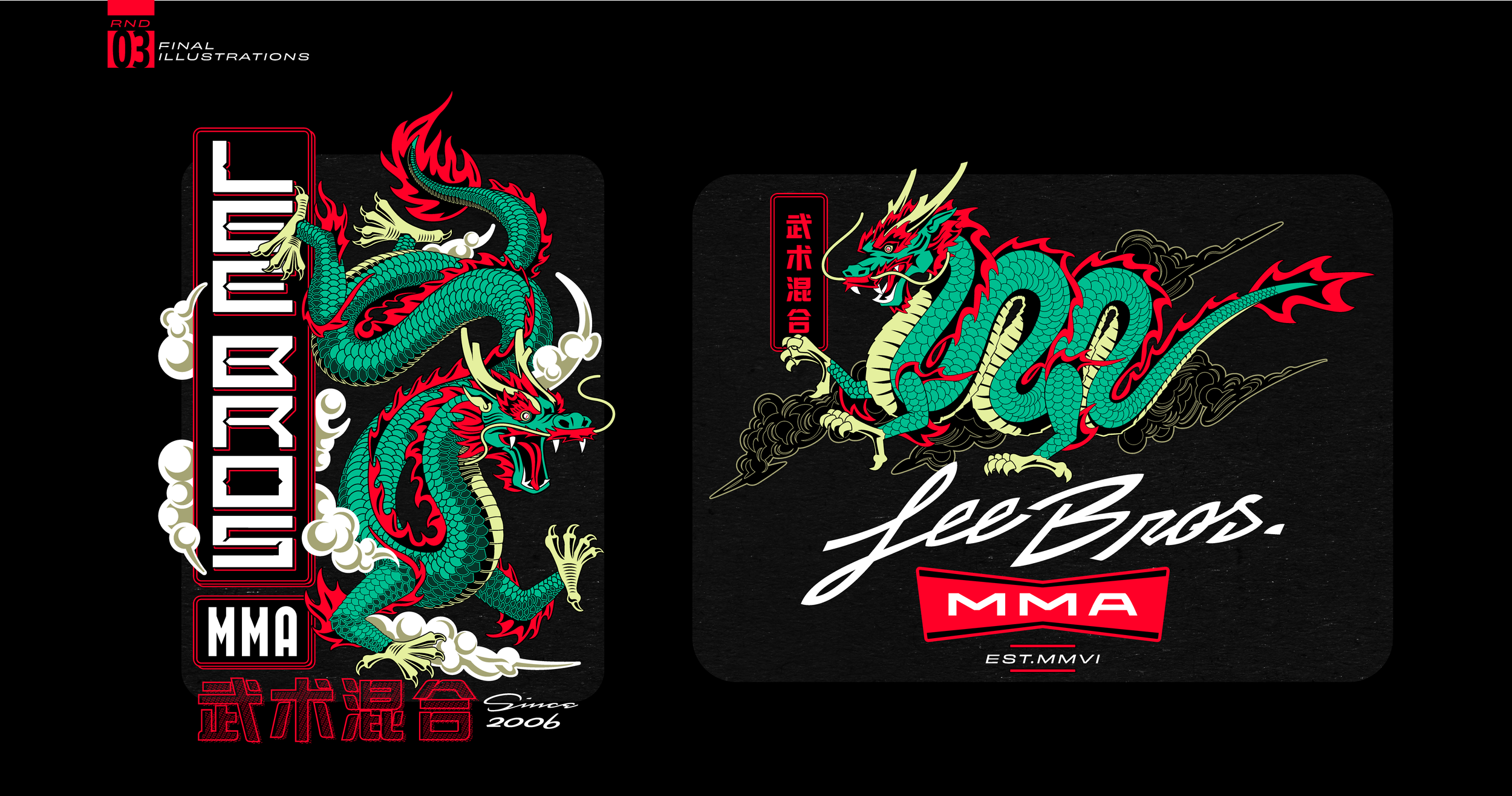
DRAGON KIT COLLECTION
This year, Lee Bros MMA is proud to unveil a special 2024 kit inspired by the Year of the Dragon in the Chinese Lunar calendar. Through creative collaboration, we began this project by crafting rough sketches that portray the vigor and power of both the Wood Dragon and Wordmark designs. These initial concepts were refined into more detailed sketches, serving as the groundwork for the final illustrations. The intricate design will be featured on their latest capsule drop of shirts, jackets, and gis.